Yes, in “some ways” the iPhone screen is better, according to the Book Oven blog, which notes the obvious advantage of mobility. But there are other plusses, too. More than a few readers may actually prefer to focus on narrow, newspaper-style columns.
 Hugh McGuire does’t just speak up for narrow in his post. In a comment he also makes the sensible suggestion that the full New York Times be available for Stanza or something equivalent.
Exactly, Hugh. When I was pushing the OpenReader format, similar to the ePub one favored by Stanza, I approached the Washington Post with this very suggestion for OR. I had both PDAs and cellphones in mind, and Jim Brady, editor of the Post Web site, was intrigued. But the idea just didn’t fly elsewhere within the Postocracy. Today the Post shows up on the iPhone via a horrid customized interface, totally inferior to the views offered by the mobile versions of the AP and New York Times. Please, Post. Pay attention. Navigating through you on my iPod Touch is a real chore.
The book-newspaper connection
No, I’m not wandering here from the topic of books. I want to see seamless links in both directions between timely nonfiction books and newspapers, and beyond that, book reading and newspaper reading can reinforce each other.
Who knows, maybe e-books could help revive newspaper book sections, which could link to advertisers’ titles for immediate download.
The Feedbooks-Stanza combo
For now, you can use the Feedbooks-Stanza combination to read newspapers as files on your iPhone, although, in both navigation and formatting terms, it’s rather primitive compared to what it could be. You get only a few snippets of the Times. Furthermore, I doubt that the Times sees any revenue. The image shows what a BBC article looks like on my Touch. I’ve made the screen background gray—you can also see text against a white background, if I recall (unless it comes with a bit of gray built in (then you could crank up the brightness).
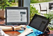
About narrow vs. wide columns: It’s a matter of reader preference. We all have different preferences. Sometimes I’m in a big-screen mood, but I often will just fire up my iPod Touch even with an E Ink screen also available.
(Thanks to Peter Brantley’s private Reading 2.0 list for the pointer.)









Teleprompter efficiency is relevant. The extra short line, sans serif with extra leading. Most important the margin cursor that could be animated to color shift on the screen.
I find it easier to wrap my eyes from one line to the next when reading on my phone than I do when reading a paper book.
I think it was actually Hugh who made the comment about the Times. I’m a big fan of the NYTimes app for iPhone and prefer to read their content that way — even over the standard website. It’s just as things should be — a single column with the image up top, easy to sort through the stories by type or tap from one story to the next, etc. I look forward to being able to read more of the web this way going forward, as it’s perfectly suited to the device, in my view.
I find your supporting citations for the superiority of iPhone-sized text rather dubious. Book Oven only says that the constraints of the iPhone call for new design principles. Karen Templer doesn’t have anything other than her own enthusiasm to offer either. Virtually all the things she enumerates about the iPhone apply to other readers as well, except: it fits in my pocket and I can read with the light. Even in her comment to Mcquire, although she makes the pitch that narrow columns are better, she ends by saying that 7″ is probably ideal, which seems wholly at odds with her dislike of the Kindle and evangelism for the iPhone. Scratching my head!
Karen and Steven:
K: Thanks for the catch! I made the correction to attribute the NYT observation to Hugh. Your comment appeared near his.
S: As I said, I have my iPhone mood and my larger-screen mood. And remember, we’re talking not just about screen size for reading, but also about portability.
Thanks,
David
And, as a news reading, blog reading, web-stuff reading device, I’ll admit the iPhone is quite good. I will probably continue to read the occasional book on it as well, riding the bus and whatnot, but still don’t think it is ideal for book-length material.
Enjoy the choices, Steve, just as I do.
Here’s one more point. Could some people like different screen sizes based in part on the way they were taught to read? Or just the general ways they process text information? Perhaps individual brain characteristics are a factor.
Highly sequential readers of linear fiction might see less of a problem with small screens than those who like to skip around a lot or who like to speed read.
I’d be the first to acknowledge that my favorite iPhone/Touch app, Stanza, leaves much to be designed in the nav department. When I want to skip around, I could be better off with, say, FBReader or Mobi on a desktop.
Thanks,
David
@StevenHarris Our own enthusiasms are all anyone has to offer. I have found the iPod Touch/Stanza to be a surprisingly compelling way to read full-length novels. The text chunks are just about perfect for my attention-span, and the light/subtle animated “page-turn” (not pretending to be a book, but still giving my mind the “a-ha! on to the next page!” feel) may actually be superior-for me-to reading a good old fashioned book, in certain circumstances, at least. There’s nothing universal here, just my opinion.
That doesn’t prove anything, but I’m willing to bet that Karen, David, and I, etc… are not the only humans who’ll feel this way. I was surprised, and Stanza has won many converts that I know personally. (My raving may have had something to do with that).
Though I would add, cf. narrow, that I read in landscape, not portrait, and find the difference significant. I don’t like reading in portrait on the iPod at all.
Steven, I’d say my position on the Kindle is nearer to indifference than dislike, but that’s nothing to do with screen size. It just doesn’t appeal to me on any level. When I first got my iPhone, I expected to read on it in a sort of stop-gap way, and that expectation was based on an assumption that the screen was too small for sustained reading of book-length text. I was as surprised as anyone the first time I gave it a try and found myself more engaged with the text in front of me than I had been in years. It was truly a revelation, and I hear that same thing from nearly everyone else who tries it. So what I thought would be a liability turned out to be an asset. I honestly prefer reading on the iPhone over reading a printed book, and I never thought I’d say that.
What I was saying on Hugh’s blog and will try to state better here was that I’d be perfectly happy to read on a slightly bigger screen (I’m saving up for the rumored larger Touch as we speak) but that beyond a certain size — and, yes, I’d put that at about 6″ or 7″ — the increase in screen size potentially becomes a detriment, or at least a waste.
But the fact that the Kindle has a larger screen doesn’t make it any more appealing to me. I’m happy for everyone who has and loves one, but I prefer to read on a thing I’m already carrying with me everywhere I go. Obviously, other people come to other conclusions.
Back in the 80s, when I was getting my journalism degree, I took a newspaper layout course. We were specifically taught that people were most comfortable reading a limited amount of words per line – about 12-15, IIRC – and this was the reason for the traditionally narrow newspaper columns. This was supposedly demonstrated by a number of readability studies, though it’s been so long I can’t cite any.
Take that for what it’s worth.