Here’s a snippet from and interesting article in KQED’s Mind/Shift blog about how ereaders can help dyslexics:
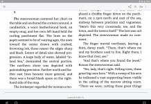
Even the font in which a text is printed may influence how readily a dyslexic is able to read. Last year, Christian Boer, a graphic designer from the Netherlands who is himself dyslexic, introduced a font he created to reduce dyslexic readers’ tendency to misconstrue letters like “d” and “b.” Boer accentuated certain features of the letters in his font, called Dyslexie, to make them harder to confuse with each other, and he inserted generous amounts of space between letters and words.
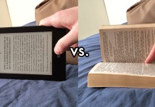
Once, such innovations would have required the laborious printing of special texts for dyslexics. But with the advent of e-readers, creating a dyslexia-friendly document is as simple as changing the settings on a digital device. Indeed, some dyslexics are already doing so—such as the prominent economist Diane Swonk, who has spoken about how she uses her Kindle to adjust the font and limit the number of words she sees when she reads onscreen.









Except when you visit the site you learn what a huge ripoff the font is. Just for personal use, it’s 69 dollars. Costs jump significantly when you go to educational pricing – 445 euros. Not quite the story of philanthropy, more of greed. Until someone releases a font for very low cost, or even free, it won’t take off and become mainstream. Unless it becomes mainstream, dyslexics will still have to learn the techniques to deal with processing all the “normal” fonts used.
There is a tremendous the amount of educational benefits that are available from technology devices if we use them wisely with children.