 Henry Melton, whose book Emperor Dad I have recently reviewed here, writes in his blog about one of the difficulties of converting his own books into e-book formats.
In this particular entry, he focuses on the problems presented by scene breaks. For print books, there are stylistic methods of conveying a scene break without interrupting the reader, such as the dropped capital—enlarging and shifting down the first letter of the first sentence. But e-books by and large do not yet offer that sort of finesse of control over the reading experience—and to make matters worse, different e-book formats or converters often have quite different requirements or capabilities.
So back to the scene break. How to give that subtle cue to the reader? Most of the automatic book converter tools I’ve tried end up stripping scene breaks. Unless you care about confusing the reader, you’ll have to wade through the converted text and page by page, fix up the scene break; possibly by putting back a variation of that ‘###’ that the manuscript had in the beginning and hope the reader doesn’t stumble over it.
This is the sort of thing that people who make their own e-books often have to think about. Perhaps those who make e-book converting applications should keep it in mind.






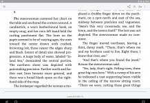


A couple of books I’ve read recently put the first word of the break all in caps. It works quite well. I would think this would be a good algorithm to follow when converting from print to ebook.
I use 5 asterisks, centered, with a space in between and a line above and below:
* * * * *
I don’t think it’s worth doing much more than that while e-book readers are so primitive and so few people read them. I could have embedded .pngs and such, but it would’ve only added to the size of the file, and it was already huge. You start adding in graphics and size starts to matter.
I have a free e-book I got that has tons of .pngs for scene breaks and I can’t load it onto my eBookWise. It’s just too huge a file. I will probably never read that book because it’ll take up the reader’s entire space and I’ll forget about it by the time I’ve read the other 85 books I’ve got in it.
Well. The asterisks were centered in the PREVIEW!!!
I know that your comment is several months old Moriah, but it’s somewhat relevant to the discussion that’s taking place re: problems with authoring ePub files. Do your recall how you attempted to center those asterisks? Was it a <center> tag by any chance?
No, I use a style, viz.:
p.asterisk { text-indent: 0px; font-size: 1em; font-weight: bold; text-align: center; margin-top: 3em; margin-bottom: 3em; }
Then the corresponding tag in the body.
THE PROVISO is somewhere around 300k words with all the front matter and back matter. In the book, there are e-mails, blog posts, news clips, transcripts (3 different formats). I also have a ToC, which is absolutely OBLIGATORY for any e-book.
Styles were absolutely necessary to make everything look the way I wanted it to.
You can do drop caps in epub. The problem is that not all reading software will display them correctly. FBReader won’t display them at all, as it doesn’t have full CSS capability. The first version of ADE didn’t display drop caps correctly, but the current version does an ok job of it.