 Tastes vary. But I myself hate spaces between paragraphs when I’m reading e-books on a Kindle, Sony Reader or other gizmo with a small screen. Wastes space.
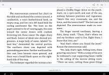
And it’s especially frustrating when I’m reading dialogue. If you’re like me, wouldn’t you rather that the books look the way they do in the Kindle screen shot to the left?
Mercifully a fix exists for nonDRMed e-books—the Calibre e-book management and conversion program that John Schember has written up in The ABCs of e-book convresion: Easy Calibre Tips for the Kindle, Sony and Nook, as well as in A beginner’s guide to Calibre.
You can download Calibre for Windows, Mac and Linux machines. Calibre’s current 0.6.33 version, just released, even lets you install a dictionary feature within its e-book-reader.
Now here are the easy steps to rid your books of those evil spaces:
![]() 1. Fire up the Calibre program, which you can install and get going with guidance from John’s simple tips.
1. Fire up the Calibre program, which you can install and get going with guidance from John’s simple tips.
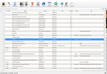
2. Double-click on the Preferences icon in the upper right of the Calibre screen, the one with the hammer.
![]() 3. Choose Conversion, which appears on the left of the program’s screen.
3. Choose Conversion, which appears on the left of the program’s screen.
4. Put a checkmark ahead of “Remove space between paragraphs. You can also do the reverse and, rather than do this, tell the program to add spaces between the paragraphs in book files where they don’t exist.
 If you choose to remove space between paragraphs, you’ll be indenting the first lines of each. And if you look a bit to the right on the Calibre screen, you’ll notice you can vary the indents’ size.
5. Click the OK button in the lower right of the Calibre screen.
6. Next time you get a book into Calibre, use a conversion option even if the book is already in the proper format for your Kinde, Sony Reader or whatever. That way, the change you made will have an effect.
To answer one question, yes, this will work on books you download from Google Books for your Kindle or other machine. Even if you have a Sony or Nook, you may want to skip the default bookstore’s Google Books option and instead download them to your desktop machine so Calibre can fix the spacing.
A related tip: For some e-readers, not all, you may be able to turnall text into boldspacing for better visibility on an E Ink screen, which lacks the best contrast between text and background. While you’re in the screen for conversion options—the one mentioned in Step #4—you can insert some special code within the big “Extra CSS” rectangle:
body { font-weight: bold }
OK, give the above suggestions a try, and let me know in the comments area if you have any problems.


I’d just like to point out that this only works on non-DRM’d free/shared ebooks. Calibre won’t work with anything you’ve purchased from the Kindle or Sony stores, or any other ebook store that uses either Adobe or any other kind of digital protection. I’ve found I don’t necessarily like the formatting job that some books come in, but there’s nothing I can do, because they weren’t open copies.
Again: Half-assed hacks that don’t actually solve the problem.
Bold fonts are a hack to overcome shitty system fonts with single-pixel stems.
Only paragraphs following other paragraphs get indented, not every paragraph in tarnation.
p+p { text-indent: 2em; }(choose your own value) accomplishes that.Your screenshot – allegedly of the new, improved text – retains full justification, with resulting rivers and completely absent hyphenation.
A little knowledge of typograph is dangerous. You people are pretty dangerous.
K and Joe:
K: I share your hatred of DRM. Thanks for bringing it up. But yes, if you go back to the post, you’ll see I wrote: “Mercifully a fix exists for nonDRMed e-book.”
Joe: We didn’t present the line-spacing tip as an all-purpose solution for every typographical failing. But as long as we’re on the subject of justification, Calibre does have a “No text justification” option within the conversion menu. I might add that to the piece if I get a chance. Meanwhile I couldn’t agree with you more about the “dangerous” part.
Some of the worse offenders are big publishers that could do much better. While some publishers use Calibre as part of the workflow for e-books—perhaps refining from there—the real demand for it is from people who simply want to customize their books for maximum enjoyment. I wrote the post with them in mind.
They are not in typographical competitions. Furthermore, as I’ve noted, individual tastes will vary, especially for private reading, and some people may hate the typography you consider ideal. Power to the reader!
Thanks,
David
Look in this post, and above this post… in fact, all the way to the top of the page… and what do you see? Paragraphs of text with an extra space, and no indents, which to my eye are perfectly readable.
I point this out just to say that the most important thing is to be able to recognize the start of a paragraph. Whether that is accomplished by an indentation, or a space between paragraphs and no indentation, is a personal preference thing.
Personally, I think they both work just as well. And I suspect people are getting used to breaking paragraphs with spaces instead of indents, as they spend more time reading electronically. True, extra spaces can be an issue when you’re dealing with limited screen space (for instance, reading on a PDA or smartphone). But for larger reading devices, not so much.
I think that, better than advising publishers to force indentation in their text, they should simply use appropriate markup to delineate each paragraph (simple, less work for pubs, and therefore saving them in production costs), and leave it up to our devices to render the text as we prefer it: Indents, spaces, both, neither, all-cap first word, boldface, pictographs, etc.
That would give the device manufacturers the excuse to build better rendering choices into their software, thereby allowing consumers to choose devices and display options according to the rendering engines they prefer. Creates better device competition, more choices for consumers, lower costs to publishers (reducing e-book retail costs), and a more standardized industry all around.
Just my 2 cents.
Steve: Thanks, but keep in mind most dedicated readers have screens of six inches or smaller, and iPhones have much less. So real estate really does count. Just my two cents, too. No “right” answer exists or all. Thanks for speaking up—I emphatically agree with you about the need for options. David
@David: That’s why I specified that the device should have the capability of allowing you to make that choice as you prefer, as opposed to forcing it onto the e-book formatting.
I read from a PDA, so I understand the issue completely. Nonetheless, creating forced indents in the e-book formatting is the wrong way to solve the problem. It’s like forcing television programs to remotely preset everyone’s brightness and contrast controls, instead of allowing the viewers to adjust the brightness and contrast at the TV set. Control should be at the viewer’s discretion, and not forced into the initial product (which will only satisfy a few, and tick off the rest).
“Control should be at the viewer’s discretion, and not forced into the initial product (which will only satisfy a few, and tick off the rest).”
I agree. What really irritates me is when I run across an electronic text that the publisher is so sure is designed in the correct manner that the publisher makes it difficult for the reader to alter the design.
On the space-versus-paragraph issue: I read in 28-point type. Most paragraph indents, if they’re of a fixed size, just don’t show up as more than a hair’s width when the type is that large. So I do prefer breaks between paragraphs in electronic text. But I also agree with Steve Jordan that reading devices (and reading software) should have the ability to switch between different styles of paragraph indication.
This is what CSS is for. The user of the ereader should be able to change the CSS. Of course with a user friendly interface.