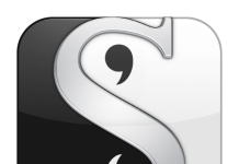
 The official ePUB logo has been announced. According to their web page the IDPF received 203 entries from 18 different countries, and the contest was won by Ralph Burkhardt from Stuttgart, Germany.
You can find more details here.
Of course, as a lawyer who has had a fair amount to do with trademarks and intellectual property, I can tell you that this is a fairly meaningless exercise. Unless the IDPF decides to enforce a set of standards on people using ePUB, and then only license those who follow the standard, and then police the standard, the logo has no teeth at all. For example, look at the situation with incompatible modes of DRM using the ePUB name, or the fact that the IDPF pretty much said that they won’t enforce standards on the software that goes into ebook readers. Unless they do these things one “form” of ePUB will continue to be incompatible with another “form” of ePUB or one reader will be able to read ePUB and another will carry the ePUB logo but not be able to read it completely.
As a matter of fact, unless they do enforce such standards – since ePUB is a standards based thing – they may very well end up diluting the mark and losing it completely.
I just noticed something. They are calling it a “logo” on their site, not a trademark. Maybe they don’t intend to trademark it at all. If that’s the case then it becomes even weaker.


Looks like the lower-case Enron logo.
http://sharealogo.com/wp-content/uploads/Enron_ai.png
Paul, the logo is useful as a start, but I couldn’t agree with you more about formalities and enforcement and the DRM-related uncertainties. Luckily at least the term EPUB is already trademarked, and I’d hope that the image would be legally protected, too, one way or another, if the IDPF insists on sticking with it.
If. Yes, I’m exceedingly underwhelmed by the graphic. The IDPF would have been better off just to have used different colors with ePUB and have otherwise spruced it up. The Enron-style image adds nothing and maybe detracts. Bad association—a blunder, in fact! Why not a picture of a book, alone or with a newspaper and magazine? I wonder if organizational politics or marketing aspirations (note that the winner comes from Germany, an important part of the European market) influenced the selection process. Hey, no insult intended to Germany or even the artist. I just hate that image despite the impressive credentials of the creator. Results ahead of creds, please! I wonder if the IDPF somehow could be persuaded to undo its blunder and change the logo? Did the IDPF try any focus-group testing?
I’m also disappointed there is no logo to distinguish nonDRMed books. With DRMed books, as you’ve correctly noted, the logo won’t mean that much right now since proprietary “protection” gets in the way. And I’m not thrilled about the prospect of a DRM standard since the technology is a loser, as experiences from the music world show. The best DRM remains none.
Consider this to be tough love. I’m delighted that the IDPF is around and would urge people to offer it constructive feedback on the logo and other issues, especially standards and the possibility of encouraging experimentation with no DRM or “social DRM” (embedding buyers’ names in books and maybe using watermarks). That way, the usual DRM would not be mucking up compatibility and the logo would be more meaningful.
Thanks,
David
Mhmmm….
The wait from May 25th (announcement at “IDPF Digital Book 2010” of the logo contest winner) till June 3rd (official release via email to participants, website for the general public) felt like an eternity…the loss of momentum meant that the IDPF wasted a huge marketing opportunity here. Mind you, judging by the obsolete “press room” (2 years off), it looks like IDPF is not exactly on top of its communication process (the website forum looks equally dead).
http://www.idpf.org/press.htm
More importantly though, from a branding perspective the winning EPUB logo is quite disappointing…I fail to see how the rotated ‘e’ conveys anything meaningful about the electronic publishing industry…surely there must have been more convincing graphical cues amongst the 200+ submissions ?! To add insult to injury, my immediate subjective perception of the logo was that of a rotated swastika, and the similarity with the Enron logo is quite shocking too ! 🙂
Well, I guess the logo will at least make an easily recognizable icon in my file browser…
Regards, Daniel
That logo is just plain ugly.
A number of people on the MobileRead website–where an informal ePub logo contest has been held in the past–agree with the general feeling of dissatisfaction with the new logo (yes, including myself, a contest entrant… I’m just glad I’m not alone here, as I was afraid at first my complaints were just sour grapes).
I agree that a focus group might have been useful here, as they might have managed to choose something that had less of a look of Big Scary Corporate Entity, and more of a design that actually suggested books or literature. And as the contest specified the “ePub” lettering in the logo, my feeling is that stamping it below the actual logo hardly satisfies the rules of the contest.
Well, organizations have changed logos before… sometimes, recreating it with each new iteration of the product. Maybe we can hope for that here.
But in the meantime, I may take a page from the IDPF operations manual and start displaying this logo… in 2-3 years…
I wonder if organizational politics or marketing aspirations (note that the winner comes from Germany, an important part of the European market) influenced the selection process.
The logos were presented with no affiliation or name associated with them, so no.
Erm…the ePUB logo is way too similar to these ones:
http://www.mynameise.com
http://www.abbott.com
…in fact it is the exact copy of this one:
http://logopond.com/gallery/detail/87770
Oh well… 🙁
Oh, and by the way, the ePUB logo made it to the hall of fame/shame (“Opinions on corporate and brand identity work”):
http://www.underconsideration.com/brandnew/archives/mission_empossible.php
Cheers, Daniel