Today’s question: can you recommend an ebook that is well designed or laid out? What is a well-designed e-book anyway? Where can one find a well-designed e-book?
For normal books, you can browse at a bookstore or at a library. But where can you browse e-books to appreciate good functional design? (My city library lets patrons view some e-books through Net Library, but the result is not pretty). Mainstream publishing has its own notions of what constitutes good design: good cover, typography, organization and graphics. And some of these same principles carry over to e-books (not to mention websites). But how can one view examples of well-designed e-books without buying the book outright?
The web offers examples that are more design than book. Many take advantage of the peculiarities of the web browser (i.e., css tricks) which may not be relevant to a discussion of e-books. Here’s some which come to mind:
- gam3r 7h3ory, an experimental weblog/book about gaming.
- storyspace books which primarily use hyperlinks, graphics and javascript to convey interactivity.
- The Unknown, a postmodern hypertext experience where users can jump down rabbit holes and travel across America.
- stories from fray.com, a site that combines unconventional design with user-submitted stories. Not terribly easy to navigate, but there are times when the content exactly matches the design.
- The Flash-based Electronic Book Review, the brainchild of Joe Tabbi and Mark Amerika. On the same site you’ll find some experimental ebooks in PDF format.
- William Haroff’s List of Best Designed Ebooks (broken down by category). Haroff will be giving a presentation titled The New Book: Ebook Authoring Past, Present & Future at the 4th International Conference of the Book at Emerson College (Boston) in October.
Notice anything? Most titles listed here are designed from scratch or go beyond the strictures of today’s ebook software. Does that mean that one cannot be similarly creative on Mobipocket, MS Reader or PDFs?
See also: Interview with Carl W. Scarbrough, book designer for Godine.
(Time stamp changed to move this item closer to the top of the blog. – DR)











Sorry, Robert, but I think this is a prime example of asking the wrong question. I don’t know of any consumers who want their eBooks to be ‘designed’, any more than they want their kettles or toasters to be ‘designed’; they just want something they can use. This entails taking as much as possible of what we already know from printed books, and adding in the advantages of electronic formats. But the biggest advantage of electronic formatting is that the user can change it to suit themselves.
What’s the ‘best’ design for a word processing program? Look over the shoulders of five hundred savvy MS-Word users and you will see five hundred different screen set-ups. Some will be very similar, others radically different. But the users will bitch like crazy if you try to force them all to use the same ‘better’ design. The whole idea of ‘good design’ is a hangover from the days of mass production, when you couldn’t produce a different product for every consumer. Now we can.
The ‘best’ design will be no design at all; rather it will be something like the current HTML/browser arrangement, where the author, the publisher and the reader all collaborate to produce the kind of eBook they want to distribute or possess; and – most importantly – the reader gets the final say.
So since we already have HTML and browsers, do we need eBook designers at all? Time will tell…
Jon.
eBook designers are necessary — there’s no doubt in my mind about it. But I don’t think they are very much different from ordinary book designers: they just have to take a different medium than paper into account, a medium that is more flexible in some respects, and hopelessly inflexible in others.
Book design is rather different from many other types of design: it’s not a question of deciding where the chrome is put, how the bell should be decorated or if the whistle should be tuned in B sharp or C flat. Instead it’s a question of presenting a text as well as possible (or practicable) under given circumstances. Good book design tends to be invisible, yet very much present: a well-designed book ‘feels’ good to read, even if the general reader cannot say excactly how that effect has been produced. In this respect, book design, just like typography, is very much an ‘black art’.
Of course, there is book design of a different cast — see the book ‘New book design’ by Fawcett-Tang: too many of the designs here tends toward the exceptional to suit my taste — waved paper, holes through the book, odd materials — this is not what I have in mind, and hopefully not what Robert Nagle thinks of. What I’m after is better represented by Richard Hendel’s book ‘On Book Design’, or perhaps ‘Notes on Book Design’ by Derek Birdsall, particularly the section where he describes his design of the book of Common Worship. If books were furniture, my style of ‘book’ would be Shaker books.
At present though, some eBook reading programs as well as eBook ‘typesetters’ take on tasks they cannot perform adequately: you will find horribly spaced lines just because the program doesn’t know how to hyphenate a long word, and the ‘typesetter’ wasn’t experienced enough to know that he needed to add such hints manually. And you will find programs that do not and cannot display the lines of the text at a suitable distance from each other (with correct ‘leading’), which is one of those things that a well designed book respects. (Though for eBooks, I’d expect the book to come with a default setting that would be possible to adjust by the reader to suit individual requirements.)
The problem seems to be that the rendering software (‘the reader’) was not designed with these questions in mind: the fact that book design tends towards the invisible partly explains it, though I don’t think it’s anywhere near an acceptable excuse. That human readers accept what cannot be changed is not an indication of good design, but only a sign that there are more important things than design.
eBooks also allow for a great deal of interactivity: footnotes can be less intrusive than printed footnotes without being difficult to access, and cross references can be followed immediately by means of hyperlinks. Here, we get into the area of user interface design: if the human reader gets confused, the design is probably poor. This knowledge is fairly well established already: it’s mainly a question of applying it.
I don’t see that the need for conscious creation of these eBooks to conform to a usability and readability standard will go away. On the contrary: we will need to understand how to get eBooks to do their kob well, and also what it is that makes them work less well than expected. For that some kind of criticism, comparison with recognized examples of ‘good books’ probably is necessary. Web sites are already criticized in this manner: the step to extend the criticism to eBooks is fairly short.
“I don’t know of any consumers who want their eBooks to be ‘designed’, any more than they want their kettles or toasters to be ‘designed’”
One of the Netherlands largest chain of cheap department stores is convinced that its customers want their kettles and toasters designed. Their kettle Lapin (rabbit) is a great success, even though it is much more expensive than their regular kettle. Which, by the way, is well designed too, just not as pretty.
“they just want something they can use”
Usability requires design too. Not all design is graphic design, and not all graphic design undermines usability.
Branko: Here’s a book that provides the economic justification for design: Substance of Style by Virginia Postrel. (here’s an interview with her about the book). By the way, I don’t entirely accept her thesis.
Jon/Anders: The web browser offers a lot to the user experience which you can’t yet see in ebook software or hardware. Partly, it’s because ebook software is so closely tied to hardware constraints. Still, that doesn’t preclude creativity. The examples I point to are “overdesigned” and maybe call too much attention to themselves. But where can you find an ebook with a functional-but-still-interesting design?
Mr Jermey believes people do not want their kettles and toasters to be designed.
A well-designed kettle will not burn your hand when you pick it up to pour. It will pour liquid into a teacup without spilling it all over the counter. It will heat quickly. It will clean easily.
Similar notions go into designing a good toaster.
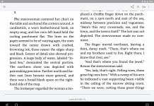
And books in general, and ebooks in particular: good design aids readability. Readability entails both easily seeing and decoding the glyphs with as little strain upon the eyes as possible, as well as making the sense of the text as comprehensible as possible.
The Table of Contents for example, where it contains links to the chapters names, should be designed so that the reader knows what the links are and how they work instantly and intuitively.
Chapter and section breaks should be spaced so that they leap off the screen or are known at an instant’s glance what they are — that the text breaks here in some way.
Good ebook design should be reflowable to fit the many different sizes of screens we read ebooks on nowadays. If designing a book for a particular device, say the Sony reader, the ‘pages’ and text should be designed with that device and its screen in mind. (For example, color graphics should be converted into grayscale with the number of shades the Sony reader can display to check on contrast and how well the image is read in this format.)
Type should be chosen with the particular screen technology in mind. Electronic screens display type differently than paper, even as rag paper absorbs ink differently than glossy magazine stock.
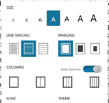
Good ebook design also should incorporate different font sizes. Some of us want larger text, some smaller. The ebook design should look nice and be equally readable, if possible, under a range of text sizes. (For example, poetry line breaks that spill over onto the next line are a problem if the reader makes the text too large. Good design will address this problem.)
In general good ebook design should address function first, but when readability in all its forms is mastered, the design should also ‘look pretty’ — that is, it should invite the reader to read on, to feel good about reading this text, to enjoy the experience as much as possible. This concerns the act of looking at the screen and the text and graphics displayed on it apart from actually reading the content, which ought to have been fully addressed in the basic functionality stage of design.
Kettles have been around for four hundred years, but I still can’t be sure when I buy one that it’s going to work properly. Modern ‘design’ has far more to do with selling novelty to jaded consumers than it does with actual function. I can’t design my own kettles, but I can design my own eBooks. All the nice features you’ve listed should be available, but the main point is that as a consumer I should be the one in control. I can make my own decisions about whether it ‘looks pretty’ or not, thanks – and whether that matters to me.
Jon.
I wanted to thank you for the list of examples of good ebook design. I’ve been waiting for the new dotreader software to be released, but in the meanwhile I’ve been publishing my articles as PDFs.
Well, best of luck to you whatever format you use, Jon. And thanks for Robert for his article. – David
[…] Best Online Novels? (Teleread) […]
[…] My teleread post asking for recommendations on well-designed ebooks. This provoked a discussion, but note that no one actually gave a recommendation (although I recommended about 10–which were not actually ebooks). […]