


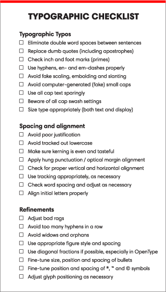
This checklist is from an article in Monotype Imaging’s fonts.com site. If you go to the original article you will find links to each item on the list with an explanation of why it is there. The list was compiled by Ilene Strizver, founder of The Type Studio and a typographic consultant.
I always recommend that designers and students make a typographic checklist to help avoid committing type crimes, as well as to aid in finessing their typography. I’ve decided to create a checklist that covers issues I’m most frequently asked about in my workshops. You can download the PDF and print it out. You can also click on the links to learn more, as I’ve previously published columns dedicated to most of these topics.


“Educate the authors and editors who provide your copy about the differences between typing and typesetting, and request that they deliver typeset-ready copy without double spaces.”
I’m looking forward to the age of self-publishing, where writers can tell people like this to go piss up a rope.
Frankly, I’m not sure what most of that stuff even *means*. In a world where your text might be read as anything from a bunch of screenshots to a PDF to HTML to bare ASCII text, what’s the use of spending a lot of effort on stylistic tricks? Is the reading experience really enhanced by using “smart quotes” instead of straight ones? Should we honestly expect readers to all use HTML5 just so our fractions are nice pretty characters instead of “1/2”?