


Michael Agresta has an article with this title in Slate. It’s far from the usual repitition of cliches we see in articles of this type and is well worth reading. Here’s a typical example:
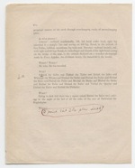
As e-books overhaul and re-present many long-standing paratextual categories, we trade off layers of established meaning. The typescript page shown here, from James Joyce’s Ulysses, is a famous example of a paratext with clear authorial intent. Joyce asked the printer to enlarge the final, redundant period at the end of the “Ithaca” chapter. On a Kindle, the reader can adjust the font size herself.
Joyce wanted his free-floating period to be especially visible because it meant more than the average punctuation mark—it gave a full stop to the long “sentence” that was Ulysses. Recently, several young writers have further cultivated paratextual elements like punctuation, typesetting, and binding as arenas of authorial expression. Dave Eggers prints body text on the cover of his book; Mark Z. Danielewski uses colored, upside-down, and Braille fonts; Salvador Plascencia crosses out words and blacks over whole columns of text. Laurence Sterne’s 1759 novel Tristram Shandy, with its blank, black, and marbled pages, stands as an early precedent for these sorts of explorations.
Thanks to Michael von Glahn for the link.


