 Jennifer Brook (The New York Times), William Couch (USA TODAY), Craig Mod (PREPOST / Flipboard)
Brook: designs mobile apps for the Times. Bad things happen when past and future collide. Gadgets often stop working. Did an initial design which they liked, but realized that didn’t fully understand the platform and scrapped it and started it all over again. Needed to understand how people would use the device and what they wanted. Decided that the Apple ad was right and people wanted a “lean back” reading experience. Primary challenge: how to design something new, and make it feel familiar. Two goals, let people know it what the Times and people had to understand it immediately after launching it. In 2009 had one mobile application and now have 10. Apps are a distinct category different from print and web. 4 rules: great ipad apps are platform savvy, start small and improve over time, demand collaboration to build and are crafted to enhance the lives of human beings. Platform savvy: distinct differences between platforms and must take each into account. Apps are not a panacea, need to design for browsers as well, they are the lowest common denominator. Platforms will increasingly have less in common with platform will put you under a false sense of constraints. People expect your app to look and feel the way the platform wants. Need to read iPad/iPhone Human Interface Guidelines. Android, Blackberry have similar guidelines. If break the rules be sure the it is worth the pain. If you break the rules it will be harder to change it when the platform changes. The more features the less people tend to like the app. Killer apps do one to three things well. App should be specific, useful and easy to use. Took several months to introduce full screen photos into the app because it required so many design changes from other departments. You have to start with a simple working simple and then gradually evolve to more complex. If launch a complex 1.0 app it won’t work well and will be difficult to change. Crucial to design apps that can evolve with the platform. Alerts are often badly designed.. The widespread dissemination of touch interfaces will be seminal. Since most important thing can do to design a good app is to put it on the device as soon as possible – you should interact with it as much as possible. Designing work on a desktop can be deceptive. Review work in the same context that user will see it. The desire to design useful tools for human beings should inform every decision the designer makes. iPad is different from iPhone in that phone existed for a year before any applications developed for it. iPad was mainly developed for “in the dark” and so is more primitive than the iPhone so far in terms of standards. Have a lot of readers outside of the US and think about readers outside of US because they have more expensive data plans. Still debating about how much news to throw up to the user when the app opens.
Questions: Photos app is best friend in terms of seeing your work on the app, including sketches. Keynote is a very powerful prototyping tool and have been using it almost exclusively. Can build out 80 – 90% of application just using sketches. Universal builds are a great idea. Times didn’t go that way for business reasons. Decision to come out with first app “Editor’s Choice” was a business decision, not a technology decision. Major criticism was that didn’t have full content. But after released full content app received a lot of criticism that had too much content. People seem to be using the iPad app the same way they would use the paper media – breakfast, lunch, evening and weekends.
Couch: must circumvent how distracting the iPad can actually be. Consider the device: many developers don’t really think about this. How the device interacts with the environment. Different from a computer – can be inside or outside, stationary or moving, focused or distracted. Have competing elements of space and behavior you have to think about. Need to understand the “habit fields” that surround the device. Most noticeable difference between the Kindle and the iPad is that Kindle is static and waits for you but the iPad wants you to do stuff with it. Need to achieve the Kindle’s sense of “calm” even though you are working with a glowing screen. Should think about the culture that surrounds the device. Think about platforms as cultures. Five elements of culture: population, market share and demographics; customs, styles, governance and beliefs. Consider the physical interactions. Touch is the first interaction, working with a hand not a pointer. A clumsy and large interactive method, also a more intimate experience. For USA Today wanted large touch contacts, reduce interactive areas. Best to make the content itself the tap targets. Think about how people are holding the devices – laps, lie down, cradle in arm, flat on a desk, propped up on a counter. They put controls, as opposed to tap targets, at the edges to make them easier to access while holding the iPad. Gestures pretty much experimental at the current time. Three, four and five finger gestures don’t have parallels to the computer world. Think of them as keyboard shortcuts. Should have an API if delivering any sort of dynamic content so that can deliver to any device that connects to the net. Content that tends to be suitable for these devices tends to be long form content. We are still in a maturation period and people are probably expecting too much at the current state of things. To get content from USA Today onto the iPad app the company had to literally transform a lot of its internal processes throughout the paper and still a lot to do. 50meg limit to iPad downloads will change in the future as newer iPads get more memory. Likes the idea of book covers because it is a central image surrounding the book. For CMS still running on the one that populates the website – actually the CMS ports to the API. The feeds send everything to all apps and the app decides what to use.
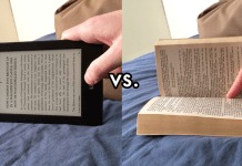
Mod: the reality is that HTML 5 is the future of books and content. Screens with paper density will be available soon. The precepts of great typography will prevail once get high def screens. Concept of ownership is dissolving – idea of owning the artifact is going away very quickly. An increased value to marginalia – notes, highlights, this is what you will really own in the end. Physical is not going away. The Daily is being iterated on a daily basis and everyone should read it to see how it changes day to day. We need people to be taking risks like they are and it is fascinating to see how it plays out. What is The Daily selling – an experience. Magazine layouts translating one to one to iPad is a slippery slope because need to train the user when you take non-interactive presentation and make it interactive. It’s unclear in The Daily what to tap on. They have articles that have several parts but once get “part 2” on the next day there is not way to get back to part 1. Difficult to know how to walk users through content that looks familiar but really isn’t. Dual modes on iPad, landscape and portrait, requires a pretty astute user to figure out what is going on. Very confusing to have one story in landscape and then change the story whey flip the iPad. If thinking about doing a content of this type watch The Daily every day to see how it evolves. Formless content, like a plain books, works well on epub. “Definite” content is content where the display has as much meaning as text, can’t be reflowed and get the same experience. HTML 5 should be considered because: does complex layouts well, ubiquitous (anything with a browser can use it), typography getting better and better, epub is basically HTML, already lots of software that uses it (Kindle Reader, Scribd, Ibis reader, Monocle, Google Docs, Adobe, Treesaver.js).; layouts work. Epub doesn’t have to be ugly and version 3.0 will have a lot of interactive features that may be an alternative to interactive Apps; it is basically a wrapper for HTML 5 and CSS. PDF is searchable and so can still be very useful for something like a guidebook. Tablet content has 3 cornerstones: make compelling, steal worthy content; remember accessibility; when in doubt use HTML 5, it can be wrapped in native iOS, like the New Yorker app does.. Will see a lot more advancement in Webkit views. Kindle, as a device, is the most underrated device ever – never have to charge the battery, can throw it around, gets lost in a pile of papers, have a 1,000 books on it for only $130, wireless connectivity around the world, syncs, connects notes. Book cover probably not that important any more – trained by Amazon to look at real data, reviews for example. Like a vestigial tail. Most newspapers apps throw up so much at the user when they open the app that users say “I don’t have time for this” and will close the app. Still an open question about how much should be displayed at start.


