Family friends in Edinburgh introduced me to Madeline Miller’s “The Song of Achilles,” and while browsing through the book (on paper, for a change), I came across her concluding text on the book’s font, “A note on the type”:
“The text of this book is set in Baskerville, and is named after John Baskerville of Birmingham (1706-1775). The original punches cut by him still survive. His widow sold them to Beaumarchais, from where they passed through several French foundries to Deberney & Peignot in Paris, before finding their way to Cambridge University Press.
“Baskerville was the first of the ‘transitional romans’ between the softer and rounder calligraphic Old Face and the ‘Modern’ sharp-tooled Bodoni. It does not look very different to the Old Faces, but the thick and thin strokes are more crisply defined, and the serifs on lower-case letters are closer to the horizontal with the stress nearer the vertical. The R in some sizes has the eighteent-century curled tail, the lower-case w has no middle serif, and the lower-case g has an open tail and a curled ear.”
Now, that level of attention to detail and care for materials bespeaks a true artist, as well as a devoted fan of the printed word. And typography is absolutely still relevant to the e-book era, with display fonts as critical to a good reading experience as the Old Faces ever were in the age of print. The Wikipedia article on Baskerville breathes a similar air of delight:
“Baskerville’s typeface was the culmination of a larger series of experiments to improve legibility which also included paper making and ink manufacturing. The result was a typeface that reflected Baskerville’s ideals of perfection, where he chose simplicity and quiet refinement. His background as a writing master is evident in the distinctive swash tail on the uppercase Q and in the cursive serifs in the Baskerville Italic. The refined feeling of the typeface makes it an excellent choice to convey dignity and tradition.”
Madeline Miller isn’t the only author of late to be fixated on the enduring importance of fonts in the digital era. Robin Sloan’s delightful “Mr. Penumbra’s 24-Hour Bookstore” comes close to making typography and font design the crux of a Dan Brown-style conspiracy thriller, while paying tribute to the importance of books, print, and learning along the way.
So what do you all think of the importance of fonts and typefaces for e-books? How is typography likely to evolve to adapt to an environment when so many words will be rendered onscreen? Do sans serif fonts really work better onscreen, or should we go back to a tradition where it’s easier to distinguish a capital I from an l? Do give us your comments and thoughts.




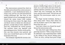





I used to favor non serif fonts for better on-screen legibility until I got my Kindle Paperwhite. Its higher screen resolution now allows me to use any font I like, and I lean towards serif fonts, because they make my reading experience more “book-like”, if that makes any sense. At the moment, I use a font I put together from various ones available, because I wanted something to combine a handwriting and a regular serif font – now my italics are handwritten.
(It would be great if a new tag could be created for this purpose for ePub and KF8.)
The problem with ereaders is that books look the same if the font is not force-set by the publisher (BAD practice when it is), so to live things up, all ereaders should come with a myriad of fonts and easy instructions on how to add more. Heck, Amazon should let me pick from hundreds of fonts straight from their website.