 In his book, Joel Friedlander helps writers go through the process of self-publishing the book, including ebook design
I’m honored to share with you an interview with the self-publishing guru and the definite number one person in promoting good practices in ebook design, the prolific blogger and writer, Joel Friedlander.
The amount of knowledge Joel shares on his blog is enormous. If you want to find information about almost any subject related to self-publishing and publishing in digital times, you have to check his blog, The Book Designer.
Today, Joel gives insightful answers related to ebook design.
There are a lot of professional designers who focus on print books only. Is it a good approach?
Many of these designers are highly trained professionals with years of experience designing for offset reproduction. Since designers now start their careers with a lot of exposure to web graphics and HTML–the same type of coding that’s required for e-books–there isn’t much of a transition for them to make. But if you started your design career before the advent of digital there’s a good chance that any kind of code looks exactly like what you were trying to get away from when you first decided to be a designer instead of, say, a chemist.
Despite the rapid growth of ebooks and the unconstrained passion for an evolution to e-reading on the part of many early adopters, print books look to me to have a long life. Reading in print and digital is really two completely different experiences, and I’m not so sure that people don’t have an appetite for both. Besides, the primitive ebooks of today are most competitive in a few genres. It will take much more capability on the part of the software and the hardware to run it than we have now to make well-formatted complex books easier to do.
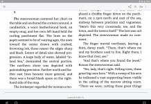
Some people consider ‘ebook design’ an oxymoron, something that’s contradictory in and of itself. At its core, book design is typographic design since almost everything inside a book is type.
Typographic design depends on the right typefaces and the intelligent use of them according to principles developed over the 500-year history of printed books.
Ebook cover design seems to be easy – you have to have a jpeg file with the cover. Is it that simple or should authors treat it as a much bigger challenge?
Oh, that’s it. The problem is, what should that jpeg be? That’s where it gets sticky. The automatic response has been to simply reduce the cover of the print book. In many cases this has saddled perfectly good ebooks with a completely useless and unreadble graphic to represent them in the search results of e-retailers. Not an intelligent decision, in my opinion. It completely ignores the potential of this very new type of design. Have a look at the monthly eBook Cover Design Awards we run on my blog, and you’ll see what I mean.
How would you describe differences between print book design and ebook design?
The chief difference between print book design and ebook design is permanence. A print book, because it will be in a fixed form forever, encourages refinement and attention to the design process and its results. In other words, if you know that book will be around for a very long time, and that whatever you put into it, from a design point of view, will be fixed and immutable, you pay a lot of attention to details. You might create a design and then start changing it incrementally, going through dozens of iterations to get the look and feel of the book exactly right. And this time and effort are repaid because, years later, that book will still be exactly the same.
In ebook design as it exists for most ebooks right now, there is no design persistence. There are very few elements that are even under the control of the designer other than the chapter openings and the general flow of the text itself. Although there are excellent designers creating beautiful ebooks, mostly on the iPad, these are a tiny fraction of the ebooks being published, and are not representative of ebook design in general. There is no permanence, and so the incentive to tweak or fine-tune the design is absent. I think this is one of the reasons that so many ebooks look so bad at this point.
The book is evolving in digital times. To which extent should this evolution include book design? What are your predictions?
Well, Piotr, our terminology will have to evolve along with our books, won’t it? We are moving into an era in which it will be difficult to even say what a digital ‘book’ is. It’s easy when we simply take a print book and translate it to a digital format.
But increasingly authors are going to be publishing straight to digital, and when you take that route what exactly differentiates your text? How is one text a ‘book’ but another is an ‘article’ or a ‘novella’ or a ‘short’ or a ‘long text’?
Book design has evolved over hundreds of years, establishing conventions that became unconscious expectations on the part of readers. Many of these conventions are things that help the reader navigate the book and uncover the author’s ideas. I don’t see why we should just throw all that out because we have shiny new toys to play with.
Ebook cover is not a part of the book. It’s a screen area which represents it. Is it a disadvantage or opportunity?
It’s packaging, in exactly the same way that the print book cover or the hardcover jacket is consumer product packaging.
If you start with a little square of digital space that simply contains the title of the book and the author’s name, you have the critical elements of a cover. But what then? The value of your cover is what you add after that. For instance, if you add a photo, an illustration, a blurb from an authority, a picture of the author, a list of points the book covers, or any combination, you’ve wandered into the area of promotion.
Book covers for books that are intended to sell in an open marketplace should primarily be an extension of the marketing idea behind the book itself, and this is no different for ebooks than it is for print books.
The elements you add can help to draw browsers into looking at the book more closely, they can imply something about what’s in the book, they can give an idea of the tone or atmosphere, the point of view of the author, the intended audience for the work, and give the buyer more reasons to buy the book.
Many of these tasks are made more difficult for an ebook cover since there is very little area to work with, so the best advice I can offer is to pick one or two aims you have for the cover, and just focus on them.
If you want readers to immediately identify the genre of your book above all—like if you’re a genre fiction writer—then go for that. If your book is instructional, concentrate on the authority of the author and what people will learn from the book.
Recently you started a new initiative – Ebook Cover Design Awards. It’s a fantastic idea to raise the overall quality of ebook design. What advice would you give to anyone who wants to submit covers?
I started the eBook Cover Design Awards for a few reasons, most importantly to give some guidance to new self-publishers.
By looking at other people’s efforts and seeing the response to them, I hope people will come to understand what makes a good ebook cover and why.
At this point, we’ve reviewed hundreds of fiction and nonfiction book covers, and those posts are becoming an incredible resource for authors, publishers and designers. It’s like a shopping mall for ebook cover design.
My advice would be to just go ahead and send them in. You might win, you might get some feedback on what was good or not so good with your effort, but you’ll be able to see your cover in the company of those from many other indie authors. And hey, it’s supposed to be fun!
In your book, A Self-publisher’s Companion, you devote a whole chapter to book design. What topics should writers be aware of before they start to develop the cover of their upcoming book?
For each cover concept you need to know the one idea you want to communicate about your book. I can’t stress this too much. If your title has the word ‘bridge’ in it, that does not mean you need to have a picture of a bridge on the cover.
You don’t have to show all the characters in the book, or all the settings in which the book takes place. A simple image that alludes to the concept or tone or genre of the book, along with effective typography, will be a better solution than a cluttered and confused visual that only communicates that it’s an amateur production.
And go look at competing books in your field, they are a great resource for ideas and approaches about what works for your kind of books. I do this step for every book cover I design for clients, and you should too.
One sentence advice for anyone who plans to design an ebook cover?
Learn typography–you’ll be ahead of 90% of your competition.
 Joel Friedlander (@JFBookman) is an award-winning book designer, a blogger, and the author of A Self-Publisher’s Companion: Expert Advice for Authors Who Want to Publish. He’s been launching the careers of self-publishers since 1994 and writes TheBookDesigner.com, a popular blog on book design, book marketing and the future of the book. Joel is also the founder of the online training course, The Self-Publishing Roadmap.
Related posts
- 02.09.2011 — Ebook Design: Interview with Sarah E Melville
- 30.09.2011 — Ebook Specific Cover Design: #4 – Shape
- 09.09.2011 — Ebook Specific Cover Design: #3 – Proportions
- 22.07.2011 — Ebook Specific Cover Design: #2 – Size and Resolution
- 20.07.2011 — How to Create Ebook Covers with Phoster Application
(Via Password Incorrect.)


I agree with some of the points about the Interview.
I think that compatibility is just as important as ebook design. There isn’t any point to engage in one if the designer lacks the experience of compatibility (making sure it works on tablets, laptops, ipads, etc.) It is also equally important to ensure that the design template of a custom design is friendly to multiple screen resolutions.
Going digital is important, but design without compatibility is shooting yourself in the foot. We’re getting at the stage where basic CSS layouts is becoming a more commonplace requirement for most custom design projects. Personally, I think that nothing is more important than understanding the niche of the ebook’s target market & the compatibility factors necessary to reach that target market. The actual designing of the book’s custom template comes after that.
Mixing them up could mean you created a great-looking layout that would impress the readership base, but the layout fails to work properly on platforms where many targeted customers are waiting.
Just like construction, a solid blueprint at the very beginning that holds compatibility as the most important aspect can save both designer & client a load of headaches.